Showing posts with label maps. Show all posts

November 16, 2016

A More Accurate World Map Wins Prestigious Japanese Design Award


To design a map of the world is no easy task. Because maps represent the spherical Earth in 2D form, they cannot help but be distorted, which is why Greenland and Antarctica usually look far more gigantic than they really are, while Africa appears vastly smaller than its true size. The AuthaGraph World Map tries to correct these issues, showing the world closer to how it actually is in all its spherical glory.

Created by Hajime Narukawa at Keio University's Graduate School of Media and Governance in Tokyo, the design just won the grand prize from Japan’s Good Design Award as Spoon & Tamago reports. It beat out over 1000 entries in a variety of categories. 

Unlike the Mercator projection, the 1569 mapping technique that you'd probably recognize from the world maps you saw in school, the continents on the AuthaGraph aren’t lined up straight across—they’re angled in a way that provides a more accurate representation of the distances between them. “AuthaGraph faithfully represents all oceans [and] continents, including the neglected Antarctica,” according to the Good Design Awards, and provides “an advanced precise perspective of our planet.” No longer does Africa look the same size as North America, or Antarctica look like one of the biggest continents (it’s smaller than everything but Europe and Australia).

The map—which is used in Japanese textbooks—can be fit into different shapes without losing its accuracy, and AuthaGraph sells paper assembly kits where you can fold it from a sphere to a cone to a flat map, mimicking the way the projection itself is made.

By Shaunacy Ferro
With many thanks to Mental Floss 
Get To Know a Map Projection: Azimuthal Orthographic

Napoleon Met His Waterloo Because He Used The Wrong Map!


November 20, 2014

Get To Know a Map Projection: Azimuthal Orthographic


A globe on a two-dimensional screen seems pretty dull compared to map projections that look like armadillos, butterflies, or deconstructed polygons. The azimuthal orthographic (as it’s formally known) is hardly more than a snapshot of Earth from some distant point in space, right?

Sure, except it was invented thousands of years before we had anything capable of flying into space to send back eyewitness accounts of our planet’s shape. Before then, the only way to see Earth from an interstellar point of view was by combining math with crap-load of imagination.

Most map projections bend and stretch the globe until it’s flat enough to show the whole world at once. In other words, most map projections show you so much that they lose their perspective. 
  The azimuthal orthographic is all about perspective. It also has geometric distortions, but only for tricking your brain into believing that the continents really are wrapping themselves realistically around the horizon. It is so good at doing this that it makes us see the world as if we were hundreds of thousands of miles away in space, and write the experience off as mundane.

Or maybe the experience is mundane because it is so familiar. The azimuthal orthographic is thousands of years old. In the first century, Ptolemy described how a geographer named Hipparchus used the projection, which he called the analemma, to map the globe. (Thanks to the jerks who burned down the Library of Alexandria, we don’t have Hipparchus’ original maps.)

Over the years, geographers toyed with the projection, but it was always overshadowed by other methods. It didn’t get much attention until 1613, when a Belgian cartographer named Francois d’Aiguilon reintroduced the projection, and gave it the overwrought moniker we know it by today.

D’Aiguilon was obsessed with the behavior of light. In his six volume treatise on optics, he presented the azimuthal orthographic as an extreme exercise in point of view. Imagining the azimuthal orthographic as looking down at Earth from a floating eye, d’Aiguilon figured that moving the eye up or down would change the distance to the horizon. In other words, the further you pull back, the more of the earth behind the horizon’s curve you can see, to a maximum of exactly half of the planet (even d’Aiguilon couldn’t see around corners, mon ami). This was an extension of his work coming up with equations to measure how much a person could see from a given viewpoint.

Carlos Furuti, a Brazilian cartographer whose website is an awesome resource for projections, shows how azimuthal orthographic projections can be used to calculate how much of Earth you can see at any altitude. For example, looking down from an airplane at 32,000 feet, you would be able to see about 221 miles in any direction. If you head up to the International Space Station, your view is increased to 1,250 miles. Impressive, but this is still only about 5 percent of Earth’s total surface at a time. In order to get anywhere close to an entire hemisphere, our camera eye must retreat past the moon, over 230,000 miles away.
But remember, Hipparchus, Ptolemy, and d’Aiguilon didn’t need to know about airplanes, space stations, or even the distance to the moon in order to imagine how Earth’s visible horizon would grow according to altitude. This is because they had imagination (ok, trigonometry too). And their imaginations weren’t limited to flying into the depths of space. The azimuthal orthographic has two sister projections that look at the earth in ways nature never intended.

The first, called the gnomonic, has the imaginary viewing eye looking outward from the center of the earth. It has some cool navigational properties, but is perhaps most useful if you’re trying to explain what the world looks like after smoking salvia.

The second, called the azimuthal stereographic, also looks at the planet, but from an eye placed on the far side of the globe looking through it. Where the orthographic causes the continents to fall away, and the gnomonic stretches them into infinity, the stereographic moderately stretches them towards the edges. Their sizes are slightly off, but their shapes and arrangement stay true to life. As such, it’s the most practical of the three, and is useful for teaching geography or plotting sea voyages. Not only does it make a pretty classy looking world map, Hipparchus also used it to map the stars.

Nowadays, we tend to think of maps as tools for flattening the world and making its dimensions manageable. The azimuthal orthographic looked at the earth another way, by giving dimensions to the world’s perceived flatness. The map might not tell us much about Earth that we don’t already know, but it’s an important reminder that only a few hundred people in all of history have every seen the earth’s shape to confirm that it is, in fact, a globe.

Special thanks to Carlos Furuti for his great website of map projections.

By Nick Stockton

Picture above: Joan Blaeu’s 1664 shows how the azimuthal stereographic makes a fairly accurate world map, even when made with incomplete knowledge of geography. Joop Rotte/Wikipedia

 
With thanks to Wired

 Mad Geniuses: 10 Odd Tales About Famous Scientists

Napoleon Met His Waterloo Because He Used The Wrong Map!
                                                                    
A More Accurate World Map Wins Prestigious Japanese Design Award

October 07, 2014

Napoleon Met His Waterloo Because He Used The Wrong Map!


As time passes we learn more and more about the past. Enormous inroads have been made into the study of dinosaurs and archeology, for example, and I have posted a few of them. But this one is for the history books and movies, like  Désirée.

Much of this knowledge is due to our advances in technology.


NAPOLEON brought defeat at Waterloo upon himself through arrogance, blunders and the use of a faulty map, according to a documentary that has shattered the French popular view that he was a military genius. 

The program, broadcast by the France 3 channel, stunned Napoleon’s admirers as it debunked the conventional wisdom that he lost to the Duke of Wellington in 1815 only because of a mistake by one of his generals, the Marquis de Grouchy.

L’Ombre d’un doute (The hint of a doubt) places the responsibility for the fiasco at Napoleon’s feet, with French historian Franck Ferrand portraying the emperor as a waning and self-satisfied figure in the run-up to the battle.

It said the emperor had never recovered from a suicide attempt a year earlier, when he took a vial of opium. Napoleon’s life was saved — much to his own despair — but he never regained his strategic prowess, according to the documentary.

His failings were highlighted by the inaccurate map he used to pinpoint British troops behind Mont-Saint-Jean farm near Waterloo. The map put the farm on the left-hand side of a bend in the road, when it was on the right-hand side of a straight road. As a result, the French cannon balls fell short of the British positions.

“We realised that there was a printer’s error,” Mr Ferrand said. “The strategic tool used by the emperor in his ultimate battle was therefore false.”

He had failed to ensure that the British and Prussian positions were known before the battle, and also failed to deliver the sort of rousing speech that had lifted the morale of his troops before his victories, such as at Austerlitz.

Claims that Napoleon was diminished at Waterloo have long been made by military historians. Never, however, have they been aired on primetime television in France, where Napoleon is widely seen as the greatest military mind in history.

The emperor himself blamed the defeat on de Grouchy’s failure to prevent Gebhard Leberecht von Blucher, the Prussian field marshal, coming to Wellington’s aid.

De Grouchy, who was at the head of 34,000 men, become bogged down in a fight with the Prussian rearguard kilometres from Waterloo, enabling Blucher to march on to the main battlefield.

Napoleon later wrote that de Grouchy’s behaviour had been unpredictable, effectively absolving himself of blame.


Clip above: 
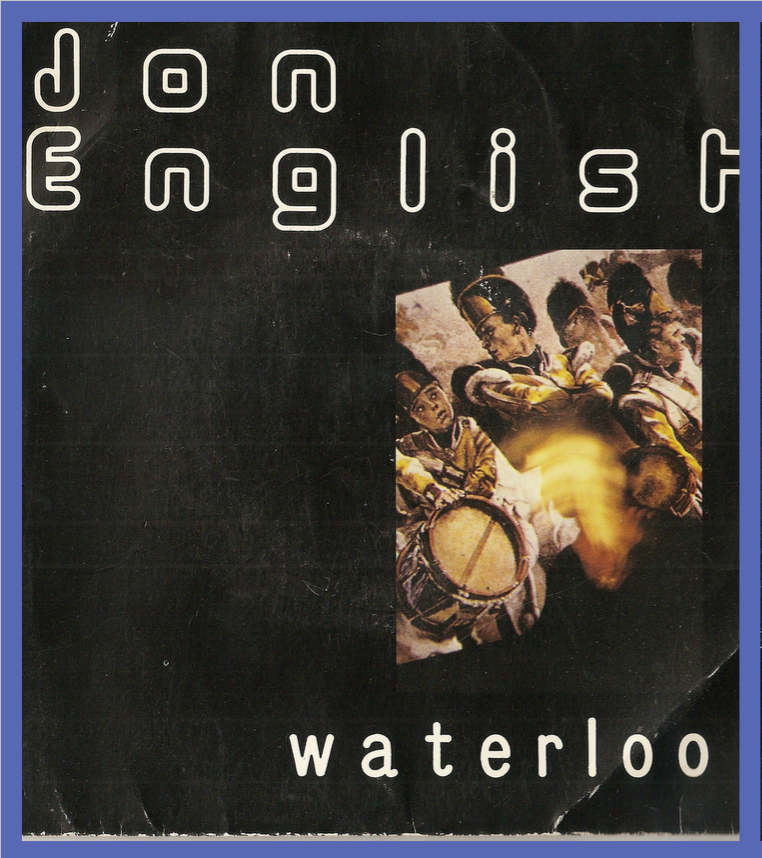
Jon English: "Waterloo" which he wrote and recorded some years ago. An easy choice for me as I think it's a great song and tells the story well.

By Adam Sage
With thanks to The Australian